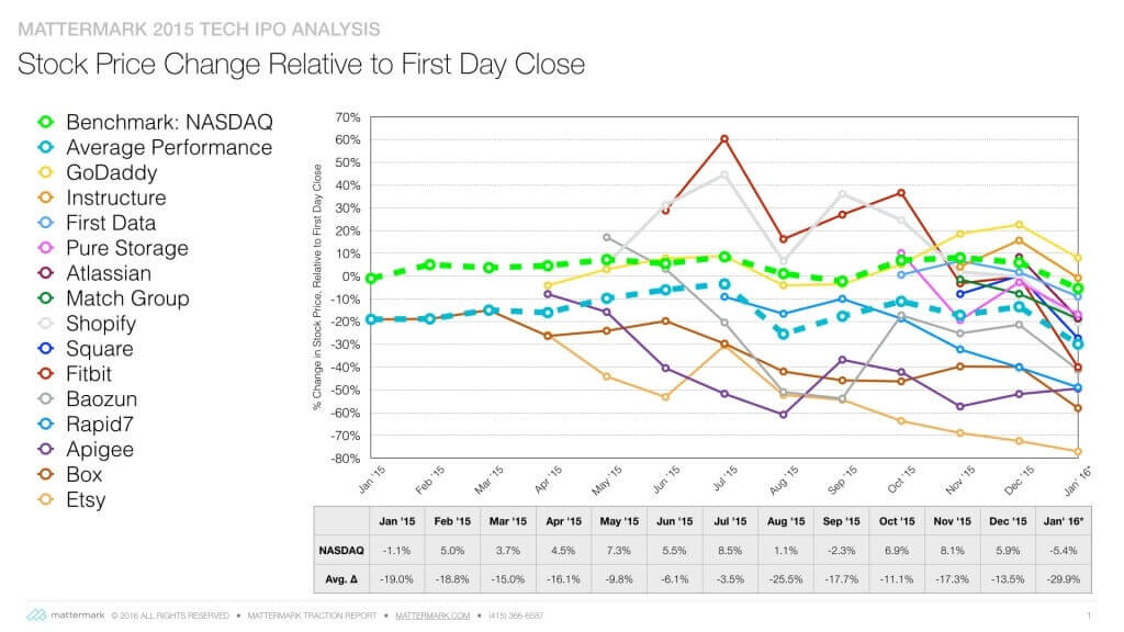
Last week, we took a look at the performance of 2015 technology IPOs compared to their then-current share price. The results weren’t pretty: Tech offerings averaged around a 30 percent drop from their first-day closing price. The impact the 2015 results could have on potential IPOs this year is not hard to grasp.
Following that post’s publication, some good feedback rolled in. A few people quibbled with our charting methodology, while others asked why the IPO market isn’t performing well. Today, we’ll take another look at the data gathered, introduce another chart, update some results, and then discuss why recent IPOs are performing as they are.
A Chart For You, A Chart For Me
First, why did Mattermark compare then-current share prices to first-day-close prices and not set IPO pricing? It’s a fair question. My thinking behind the choice was technology IPOs are generally priced to induce a strong initial day of trading, so using IPO prices as set in their offering might be too conservative.
But in the spirit of fair play, we compiled a new graph of declines that employs initial IPO prices and not end-of-first day results. To start, here’s the original chart:
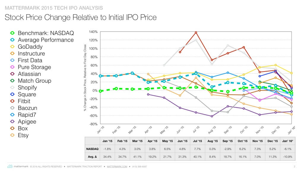
And the same data set correlated to IPO price and not a company’s first close:
That certainly looks different. The chart gets busy at the end, so allow me to help. Here’s the final result of the information:
- Average change for 2015 tech IPOs using IPO price relative to their close on January 20th of this year: -10.90 percent.
- That compares favorably to our previously calculated average of -29.91 percent, calculated using final first day data.
- The NASDAQ changed by -6.06 percent during the same period.
Even employing more generous metrics, 2015 tech IPOs failed to outperform the broader technology market. The gap between NASDAQ performance and IPO performance, however, does narrow significantly in the second analysis.
Now, we’ve been looking at our prior data set to allow for simple comparable charting. Let’s spice things up a touch by updating the data. The following information directly correlates to the above bullet points (formatting has been preserved to make it easier to compare):
- Average change for 2015 tech IPOs using IPO price relative to their close on January 28th of this year: -11.73 percent.
- That compares favorably to our previously calculated average of -29.91 percent, calculated using final first day data.
- The NASDAQ changed by -5.33 percent during the same period.
The results haven’t changed much. That’s to be expected inside of the short trading time we are discussing. If you are irked we did this sort of analysis at all, due to the noisy and daily impact of market fluctuations, that’s fine. We’ll check back at the end of the quarter to see where things end up.
Asking Why
Depending on your favored method of measuring, 2015 tech IPOs either underperformed the NASDAQ sharply or by a moderate amount. Why that happened is a fair question to ask.
Investing in IPOs is a risky business, with new offerings often spiraling up or down. For long-term winning companies like Apple and Microsoft, IPO prices later become laughably small. For other offerings, IPO prices become a goal to merely reattain. To see an IPO cohort either underperforming or overperforming the market isn’t surprising in and of itself.
Trying to fully explain market results is a fool’s errand, but we can make two modest guesses at forces that could be behind the 2015 IPO cadre’s performance.
Changing Investor Sentiment
If you ask entrepreneurs today about their fundraising process compared to a year or two ago, they will tell you that the process has become more difficult. Why? Shifting investor sentiment and expectations.
Often mentioned is an increase in focus by the investing classes on future profitability and current burn rate. You want more of the former and less of the latter. That sums to a more conservative investing ethos.
The change could impact more than just startups. Box and Square, for example, are both quickly-growing, but unprofitable. Both are down sharply from their first-day closes, while Square remains a fraction over its IPO price. Box is underwater by both metrics. If investors are warming to companies either close to profitability, or already there, they could cool to companies not near either. Several offerings from last year fit that mold.
We’re blending private and public companies here, and I understand the issues that brings up. But the mood of any single investing class doesn’t exist in a vacuum.
Recent analysis on TechCrunch makes an interesting point concerning the profitability of companies going public. The trend is negative. According to that article, 89 percent of IPOs in 2009 were profitable at the time of their offering. By 2015 the figure was 34 percent. Add in some macro uncertainty and you have a recipe for some rough and tumble.
Weaker Companies, Weaker Performance
A common perspective in Silicon Valley has been that companies going public in recent years were weaker compared to companies staying private longer. The argument goes something like this: Companies that had no other way to take on more capital have been going public, while stronger firms have been able to continue tapping private sources of capital.
The implication is we could be observing a smaller and weaker 2015 IPO crop than we might normally have expected due to broad market conditions that are, if not unique, uncommon. You can handicap this against early investor enthusiasm regarding most 2015 offerings.
You can imagine how long this list could become if we entertained every possibility, so let’s move along.
Looking Ahead
As noted above, after this piece we’re going to leave the 2015 tech IPO cohort alone for a bit, to see how results shake out. For example, the impact of tightening by the Federal Reserve may not be fully in the market.
What will be notable is how many IPOs we see during the full first quarter of 2016. So far the answer is zero. This will likely change at some point. But a quarter is only so long, and we’ve burned through nearly all of January.


