This post is part of our Startup Funding Benchmarking Series exploring the allocation, concentration, and macro trends in the financing of high growth startups.
While Series A round sizes are up significantly since 2008, readers followed up with me after yesterday’s post to suggest I look into Series B rounds which they expected would show an even larger jump in size for the same period.
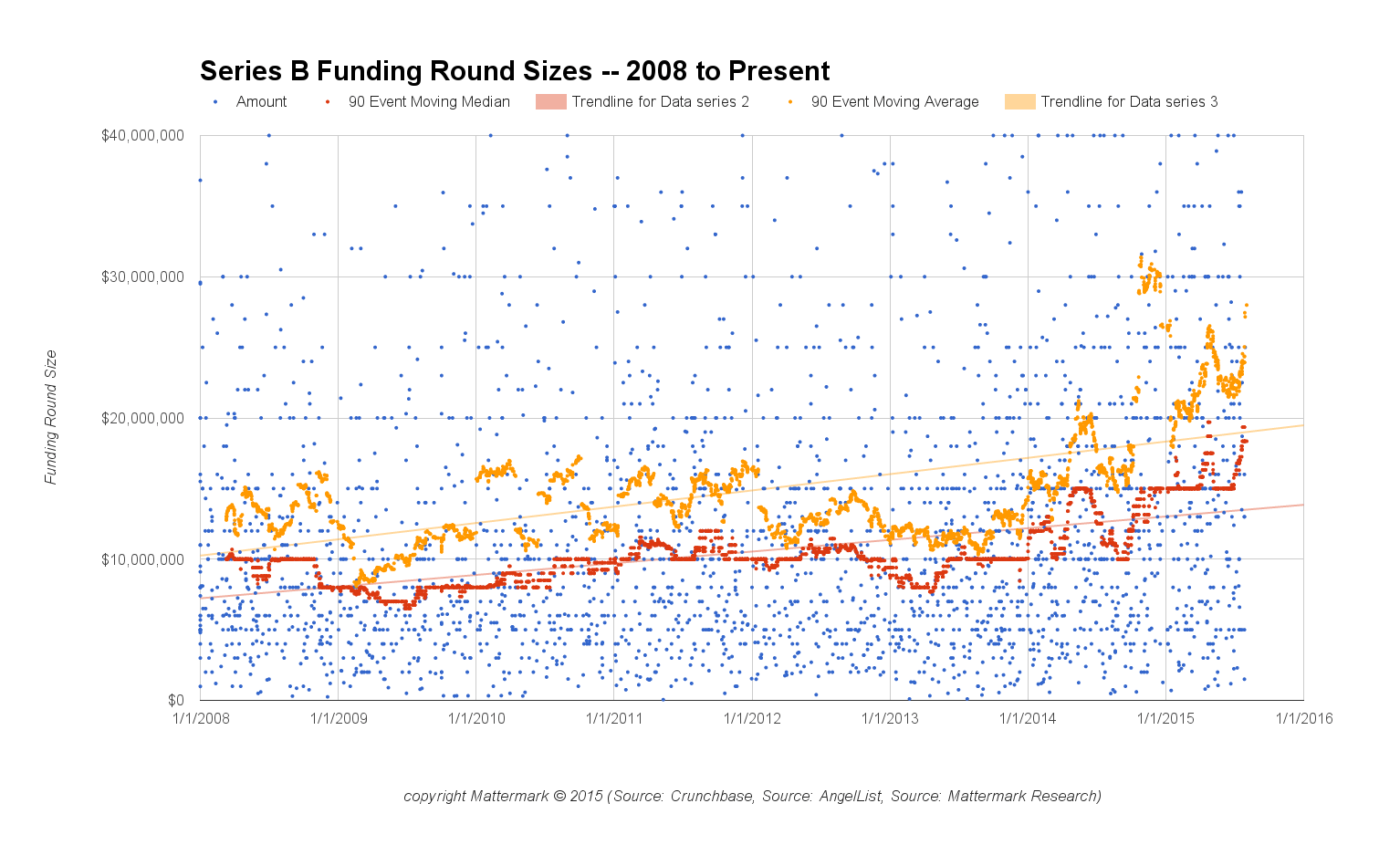
Looking at the graph, we observe that the average Series B round size peaked in late October 2014 at $31.1 million, where 28 of the past 90 Series B round sizes were recorded at $20 million or greater. The median round size, which generally lags the average but may be a more meaningful measure of long-term shift to higher round sizes, reached a local maximum of $19.7 million in late April 2015 and is approaching that peak again last week with a $19.4 million median round size for the past 90 days.
Over the entire period, the median round size for a Series B has increased by $8.4 million (84%), from $10 million in early 2008 to $18.4 million at the end of July 2015.
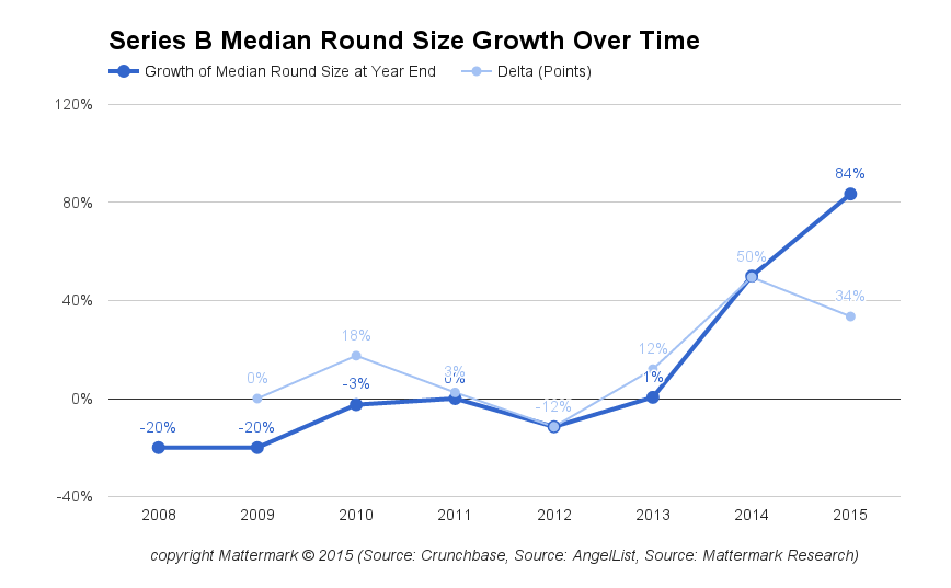
We can see that the trend for increased Series B round sizes is a more recent development, with most of the growth happening from 2013 onward. This could be a waterfall effect from companies who previously raised their A rounds at higher valuations, and then went on to overcome that valuation hurdle and take even larger sums of money. It could also be due to greater competition among firms for companies showing legitimate traction.
What do you think is causing the increase in Series B round sizes? Tweet to us @Mattermark with you thoughts.
Methodology Note: In Graph 1 we present “90 Event Moving Average” and “90 Event Moving Median” measurements, which takes the average or median respectively of the past 90 funding events announced in chronological order. You may be familiar with measures such as a 90 *day* moving average, and we would like readers to note this difference. This was done for ease of analysis, and we believe it presents a meaningful set of information to inform against this trend.
Looking for resources to help you research startups and venture capital? Sign up for a free trial of Mattermark Professional to access the underlying data for these graphs, as well as in-depth profiles of more than one million high growth companies.