Editor’s Morning Note: And lo, did the Fed leave us with a gift even as ZIRP threatens to fade into our memory like QE1, 2, and 3.

Yellen has made you a chart that you can’t refuse.
To wrap up the week, you and I are going to examine a chart from the government.1
Yes, while our elected and appointed corpus is adept at many things, including buying tanks that no one wants, and helping tank the Yahoo-Verizon deal, it is also quite good at data collection.2
Enter the Fed’s San Francisco Tech Pulse.
Pulse!3
If you haven’t consumed an ample portion of your locally-sourced vice and spent time flipping through The Federal Reserve Bank of St. Louis’s amazing chart and data collection, better known as FRED, you have yet to really fly.
But apart from the 278 listed series entries for Fixed Investment, to pick a category at random, including “Real Private Fixed Investment in Intellectual Property Products: Research and development: Business: Nonmanufacturing: All other nonmanufacturing,” and “Investment in Government Fixed Assets: Federal: National defense: Equipment: Aircraft,” there is the San Francisco Tech Pulse.
What is that, and how is it calculated?
Make sense? Here’s the current chart, going back as far as I could muster:
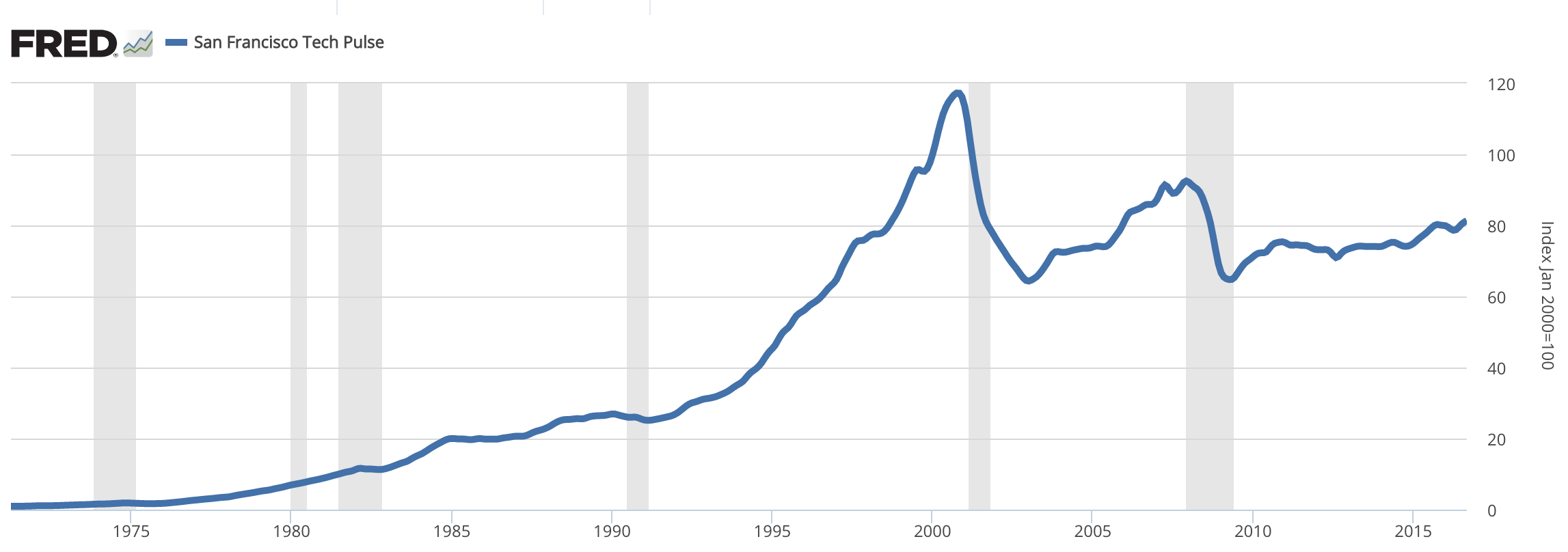
Notably, the method behind the Tech Pulse chart was rejiggered around 2008, so if you have a chart from before that era, it won’t sync with the above.
The chart says two things that are worth noting.
First, we are comfortably below measured “activity” levels set in 2000. The chart, if you note its far-right notes, is normalized to “Jan 2000=100.” In fact, the Pulse index today isn’t even at its second-highest point.
Second, it’s been quite some time since we had a correction. The period between 1970 to 1985 had three, the ’90s brought one. And since there have been two in total. However, as we are not at a Pulse index peak, any recession could push the index under its prior dips—start from a lower point and make the same jump and you might hit the ground, etc.
And if you will allow us a third entry, the unicorn-era, such as it is, doesn’t look too wild by this reckoning. The upward curve of the index compared to prior booms is downright conservative.
Perhaps the bulls are right and we are too worried about a correction.4 At least you now know where to look for the trendline when you lose your bearings.
- It’s a chart. They got us a chart. We’re welcome. Kinda.
- The hack is worse, probably, but helping the NSA insert a reverse IV into your servers can’t help.
- Yes, you can make an Ezreal skin joke here.
- No.