Earlier today we published data demonstrating that the U.S. venture capital market is on pace to experience the highest amount of funding since 2000.
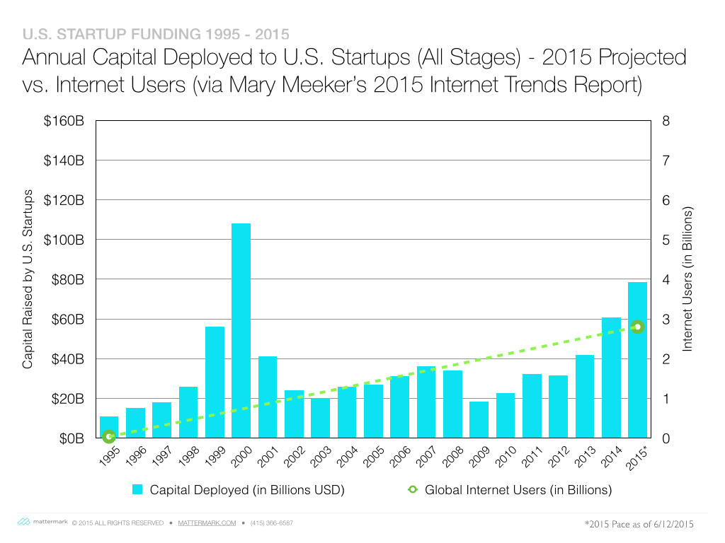
As one of our readers pointed out this doesn’t tell the entire story. Per his suggestion, I created another graph that overlays the total Internet population (via Mary Meeker’s excellent 2015 Internet Trends presentation) over the funding trend graph.

One small methodology note: the 2nd Y-axis provides an opportunity for some data manipulation here, and I have chosen 8 Billion people as the maximum because the known world population is around 7.3 Billion people at this time.
Bonus Graph
Louis Gray asked:
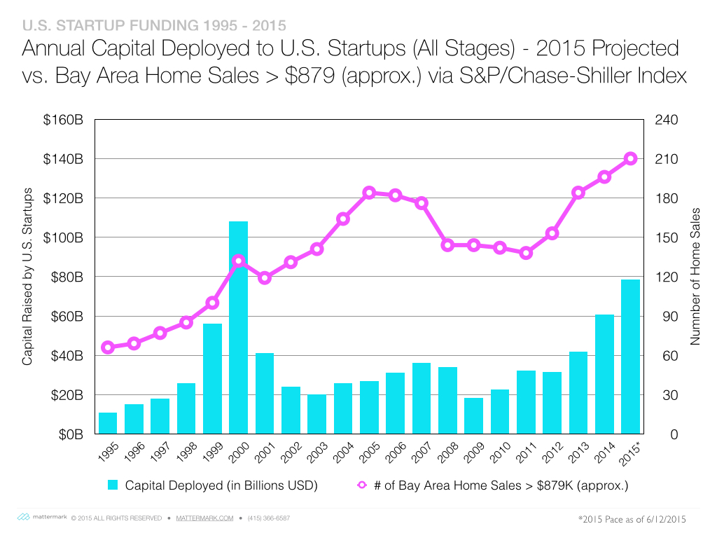
If it’s not a bubble, it’s a boil. Just need that corresponding graph of Bay Area housing prices @DanielleMorrill. https://t.co/M1mxPZrQmi
— Louis Gray (@louisgray) June 12, 2015
Here you go Louis!
